Zak Kaplan is the packaging man. He designed the huge Rancid 7-inch box set (though the bat wasn't his idea). In his band Detournement, he made a flexi-disc that could double as an assault weapon. He made a heart-shaped disc that quoted the Mao-ist doctrine.
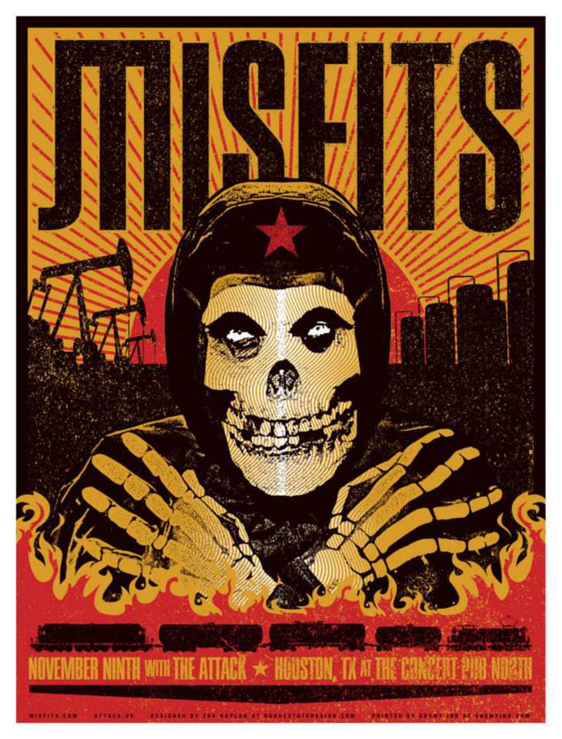
On top of that, he makes striking posters that combine Cold War and communist imagery with modern punk aesthetic. He made a None More Black poster with the Russian scythe raised perilously in the air. He placed dinosaurs next to exploding volcanoes for Catch-22. He drew a cat for Off with their Heads!
Because Kaplan is the go-to guy for packaging, and because World/Inferno Friendship Society gave him a special "thanks" in one of their jackets for unspecified reasons, Features Editor John Gentile spoke to him about his inspiration, that Rancid bat and records that might qualify as class three firearms.


What got you interested in the visual arts?
Skateboard graphics and album art. Skulls, bones, fire, snakes, all that stuff.
How did you improve your technique? Did you go to formal training?
I was a fine arts major in college where I spent most of my time improving on my skateboarding and my record collecting. But, I also spent some time studying photography. I never took a class in graphic design or computer art.
But, after I designed a few show flyers and made a zine or two, people started asking me to do this or that for them and, eventually, I started referring to myself as a graphic designer or graphic artist, or whatever. It has just sort of been a continuance of that for twenty years.
A number of your posters mix Cold War propaganda art with your own designs. What attracts you to this contrast?
I never really thought about it like that, as a contrast that is. But, I sort of get it. Maybe itâs more to create the conflict, the contrast is what helps to create a type of tension. Early on, two huge influences on me were Barbara Kruger and John Yates, and there is a similarity in the way that appropriated images are juxtaposed with these often hyper-critical texts that are treated like advertising slogans.
As a photographer I was really into Jim Goldberg, who also did a lot with image/text synthesis, often to create that tension between the subjects in the photos and their own writings in reaction to the photo. A more obvious influence would be Shepard Fairey, who I got into at the same time I was writing a paper on the history of the Soviet poster for a Russian art history class. So yeah, itâs all kind of from in there somewhere.
Similarly, a lot of your art seems to focus on a few, strong colors. Is this an aesthetic choice or a practical one?
Again, I think itâs just that style that I developed as a result of my influences. Barbra Krugerâs black, red, and white pallet, that Soviet yellow, red, black pallet, itâs an aesthetic chosen for practical reasons. Howâs that for an art school answer? Total bullshit right?!
To me, it seems some music posters focus too much on the image and the advertising impact of the poster is lost. Conversely, some posters are just plain boring. What is your philosophy to approaching the "show flyer?"
I donât know. Sometimes designs are successful and sometimes they fail. Sometimes itâs because the designer sucks and sometimes itâs because people who have no business having an opinion about visual and creative matters feel the need to inject their bad ideas into a project.
There can also be a difference between a flyer or poster or billboard or whatever to promote an event versus a limited edition art print sold at the event. Me personally, I design the same for both, for all situations. I tend to lean towards keeping the informational aspect of the design easy to digest while using an image to create a theme to the event even if there isnât one, or expanding on a theme if there is one. Pretty straight-forward I think.
How do you see punk rock and the visual arts intersecting?
Oh, itâs just packaging. Punk rock is a very visual thing. They intersect because they need to and because they need each other. I donât think that is exclusive to punk rock but there have been great moments where the music and the visual really work together and enhance each other. But itâs still just packaging and branding. Bands are no different than books being judged by their covers. Letâs not kid ourselves -- itâs all a pose, and when itâs not, it is even more so.
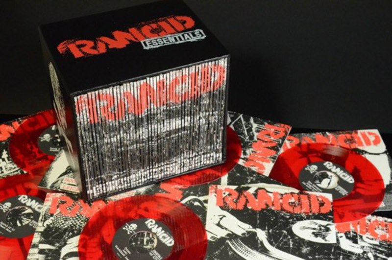
Tell us about how you approached the Rancid box set and why you selected some of the images that you did… Also, was the bat your idea?
At first, Tim was going to design everything, which I was excited for as a fan, but at the last minute it got thrown in my lap and I was more than happy to take it on. It was a real rush job, I would have loved to have had a couple more weeks to work on it. There arenât that many bands that I could do something like this for and have such a strong connection to the material.
The one cover that Tim had worked on was the first 7-inch from the "Out Come The Wolves" set and he used the song "Maxwell Murder" as the basis for the image -- a guy with a knife. So that was really it, pick a song from each 7-inch and create the imagery based on it. Sometimes the image would be the result of the feel of a song, sometimes it was more literal or specific to just a single line or word of a song, sometimes the images mimic particular themes of certain records, some of them were very specific to my own relationships to the songs.
The first five records were really easy, I know those records like the back of my hand. Some of the later ones took some listening and lyric reading to get a feel for. It was cool. The seventeen year old in me was totally freaking out. The bat though, not my idea.Fuck sports, unless itâs Frisbee golf.
In your band Detourenment, you celebrated the 60th anniversary of the people's republic of China with a heart-shaped record. Was that an ironic toast or one of appreciation?
Itâs a little of both. Itâs that contrast, that conflict again, but itâs mostly appreciation. When I was designing that, I knew the design would be based on the title track, "Awaken with Millions from One Heart." I knew it was going to be on heart-shaped red vinyl, and I wanted to do something very bright and fun, mixing this childrenâs record and Sun Records style but with a Chinese/Mao twist.
I was finishing up the layout and the news was on in the other room and there was a little blurb about it being the 60-year anniversary of the Peopleâs Republic of China. So, at the last minute I added that bit in, I thought it was appropriate.
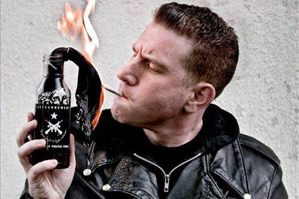
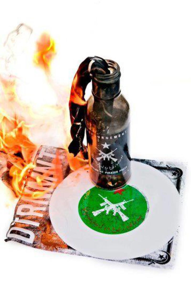
Tell us about the Molotov cocktail packaging that you made. What were the difficulties in designing that and what do you see as the conceptual implications from it?
That was the final release for Detournement, a cover of The Clashâs "Know Your Rights." That was admittedly a little more tongue-in-cheek. The events of the Arab Spring and the Occupy Movement gave the Molotov flexi project a focus, as ridiculous and juvenile as it may have been to create a release that doubles as a weapon.
Detournement, the band, for me, it was always an art project. The first release was a nod to Guy Debord, the case-wrapped sandpaper 7-inch, and that was a hard package to top. But between the heart-shaped vinyl and the Molotov flexi, I think I was able to keep up with the challenge. But the band ended shortly after the Molotov flexi was announced, and probably for the best. There was really nowhere else to go from there, packaging-wise, and musically too. But, it was a fun little thing while it lasted.
You design a number of works for Chunksaah-related bands. Have you ever had any conflict with any bands while working on their art?
No, I canât say there has been much conflict. The vast majority of bands that weâve released music from have had a real strong designer in their camp. When they donât, Iâm happy to step in and do my thing, but it doesnât happen all that often. Chunksaah is a family, not that everyone always get along or sees eye-to-eye, but even in anger there is always a very, very high level of respect from all sides.
Have you ever had to deal with unauthorized usage of your work?
I have. Iâve been on both ends of that issue to varying degrees. Itâs never fun.
Right now, in San Francisco, there is a firebrand start-up CEO named Zack Kaplan that just raised three million dollars. Do you feel as though you are in competition with this impostor?
Nah, never heard of him. I wouldnât trust people with that name.
What do you have in the works?
The problem is that everything is always hush-hush, so even if I have something cool going on, I usually canât say anything about it. So yeah, huge things, massive stuff, all top-secret, Iâm making 2014 my bitch. Not really, the less things in the works the better, Iâd like to take a vacation one of these days.